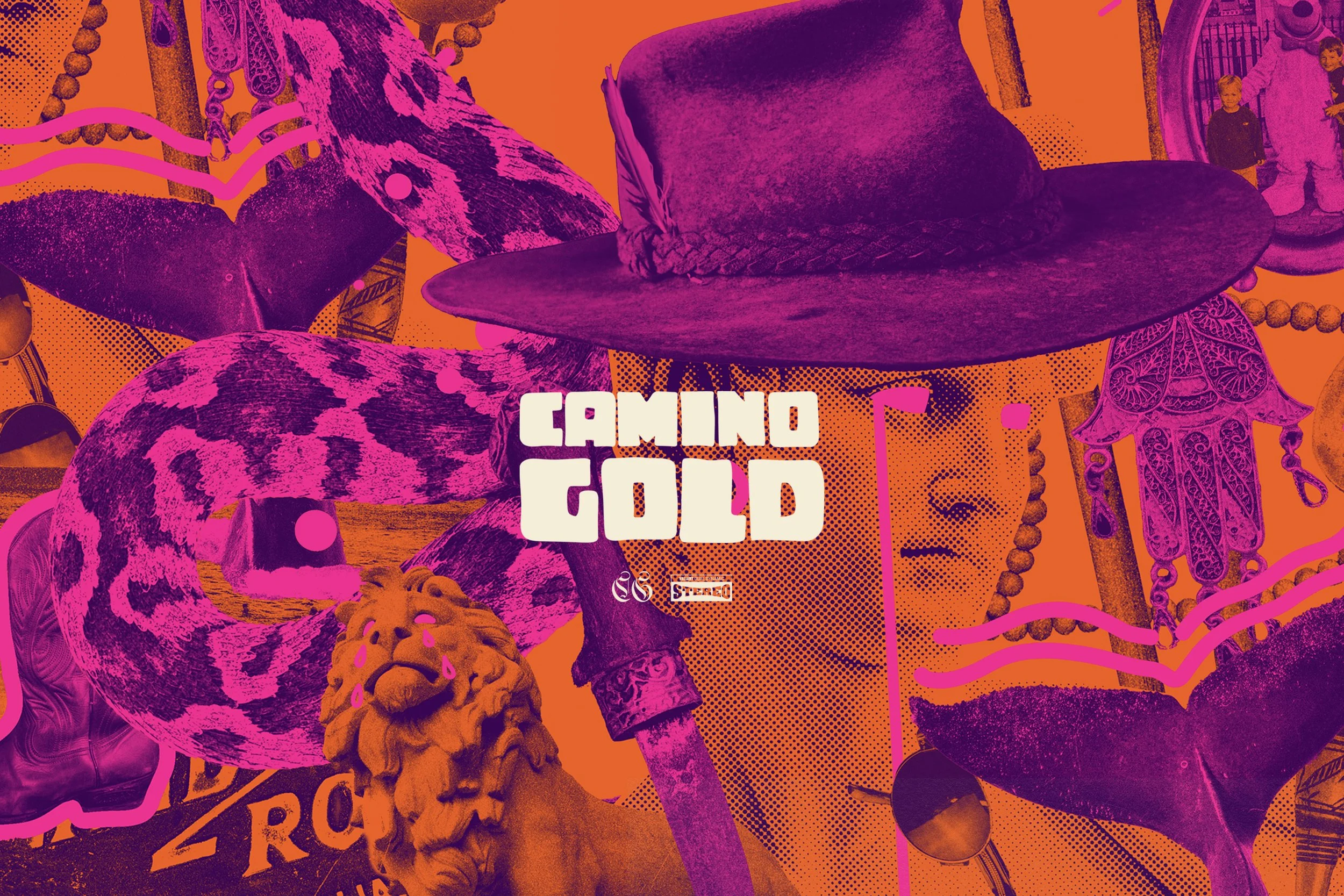
Camino Gold Playful SinsThe artwork began with the band’s own keepsakes, photographs and collected treasures, photographed and transformed into colourful collages spanning three singles, a 12-inch record, animation, posters and merchandise.

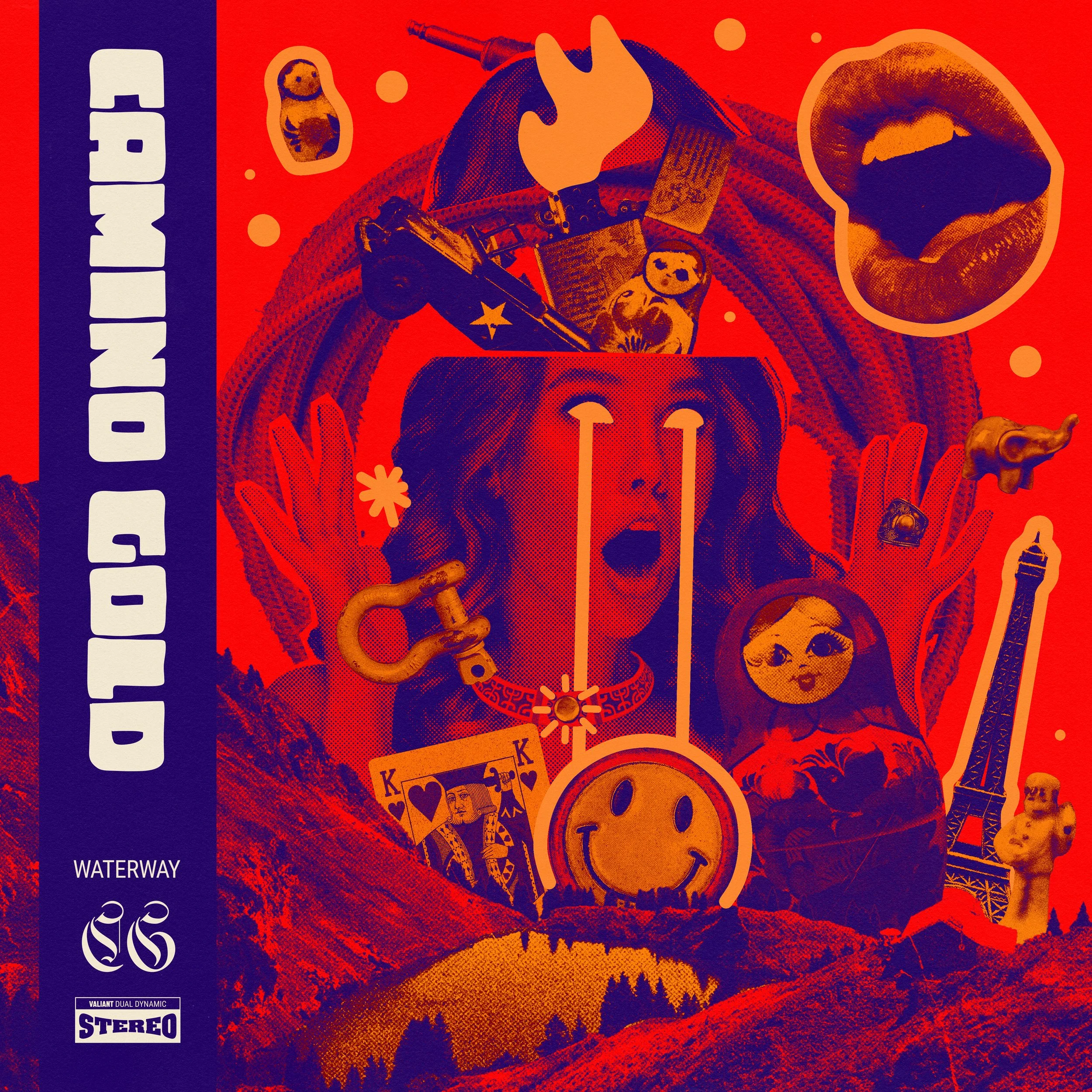
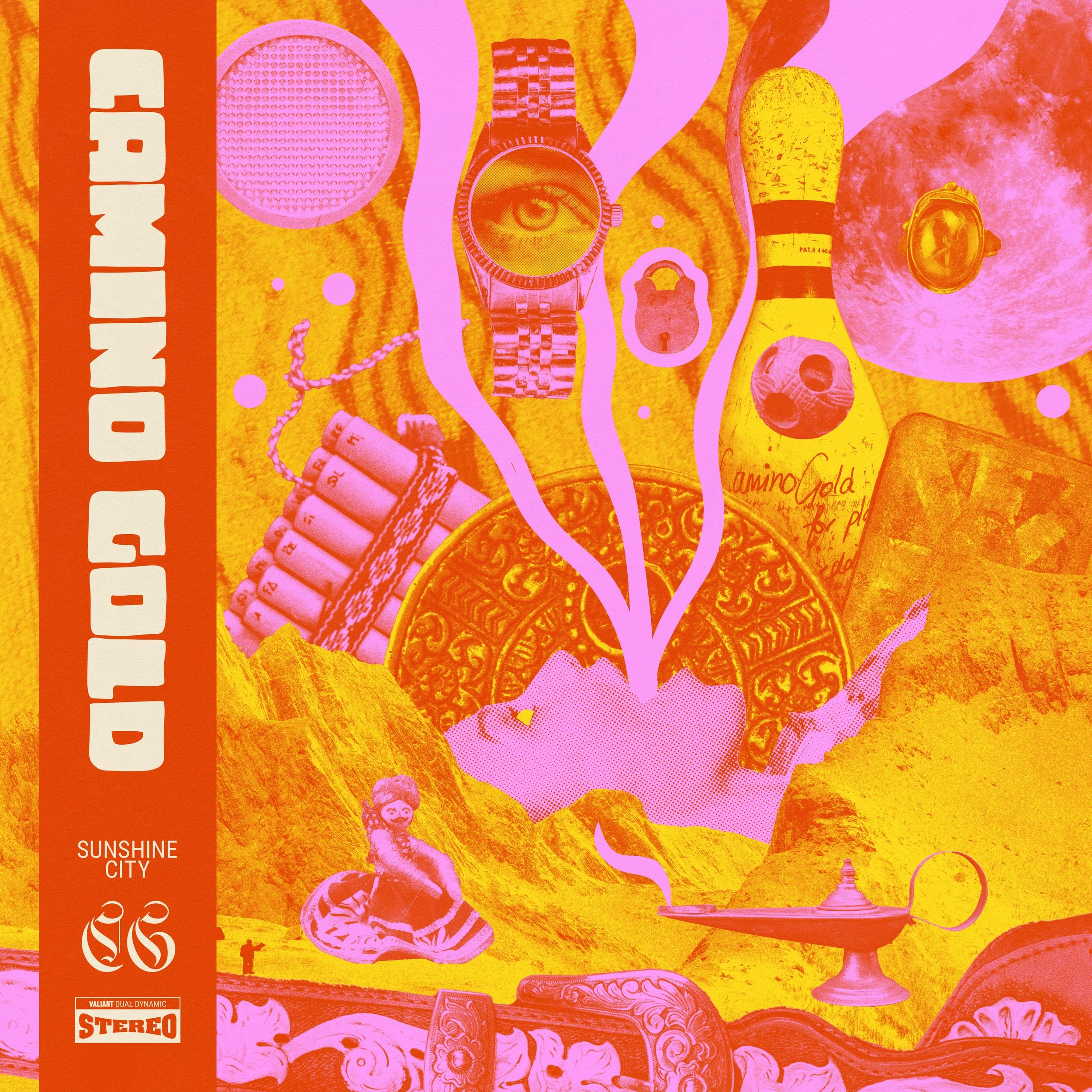
Each single became another piece of the same world, combining personal objects, original photography, illustration and collage before bringing everything together for the final Playful Sins physical release.
A record can tell you plenty about a band before you’ve even put it on. For Camino Gold’s Playful Sins EP, we wanted the artwork to feel genuinely theirs, so our Creative Director Lachlan Bruce asked the band to dig through their homes and bring in the precious objects, old photographs, keepsakes and strange little treasures they’d collected over the years.
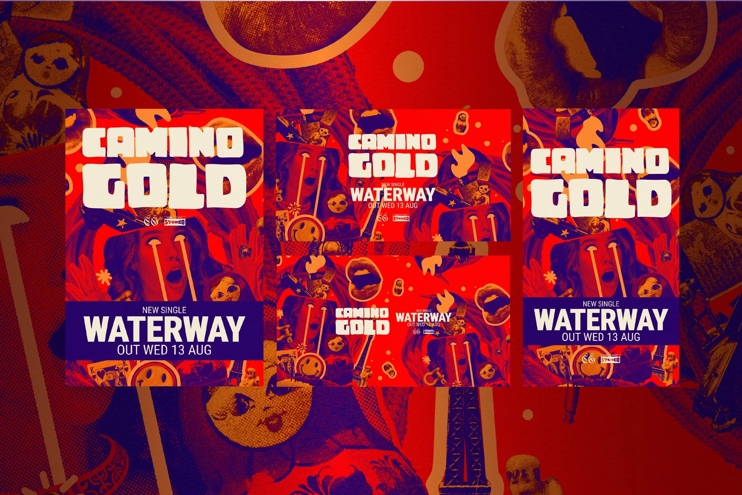
Everything they brought in was photographed and became the raw material for the release. Lachlan built dense, colourful collages from the collection, mixing personal artefacts with original photography, illustration and more classical imagery. The result was vibrant, a little strange and deeply personal, with details that could be pulled apart, rearranged and rediscovered across the campaign.
The visual world unfolded through three singles, Playful Sins, Sunshine City and Waterway. Each had its own digital cover built from the collection, but all three belonged together. As each track was released, we took elements from the artwork and put them into motion, creating animated visualisers and social content that let the collages slowly reveal themselves.
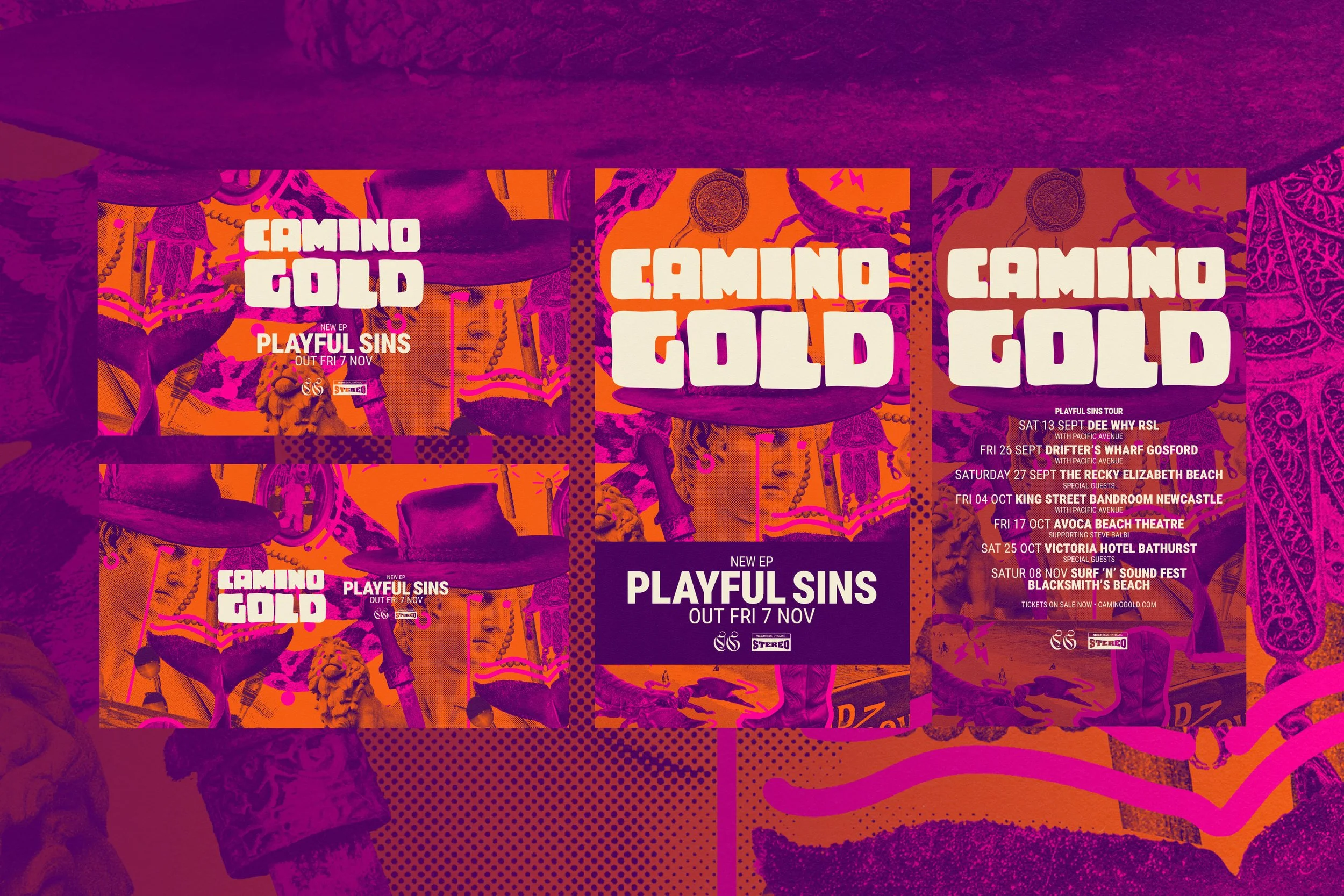
Around the singles we built the complete release campaign, carrying the artwork across social, street posters, promotional assets and merchandise. By working with the individual pieces rather than simply dropping the same artwork onto everything, the campaign could keep changing while still feeling unmistakably part of the same record.
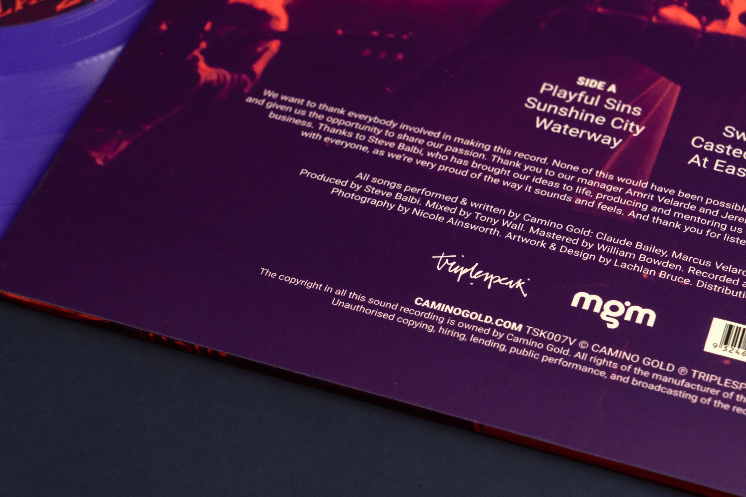
It all came together on the 12-inch Playful Sins EP, designed by Good Decisions and pressed locally by Suitcase Records. The physical record gave us room to bring the photography, illustration, collage and typography together properly, turning the collection of small personal objects we started with into something the band could hold onto.
Recorded and produced by Steve Balbi for Triplespeak, Playful Sins already had its own distinct personality by the time it reached us. Our job was really to find a visual equivalent for it. In the end, we found it in the things Camino Gold had already been carrying around with them for years.
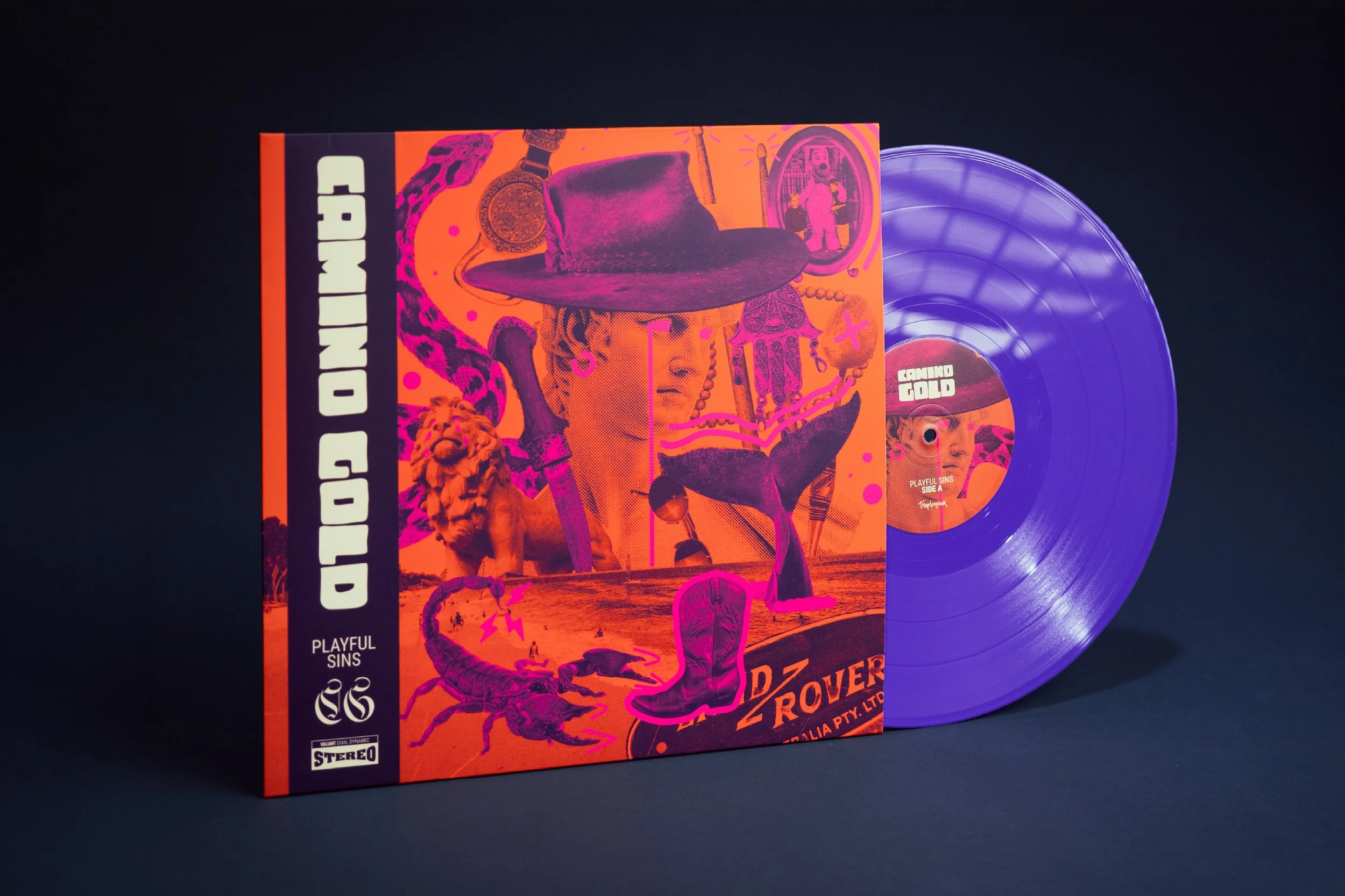
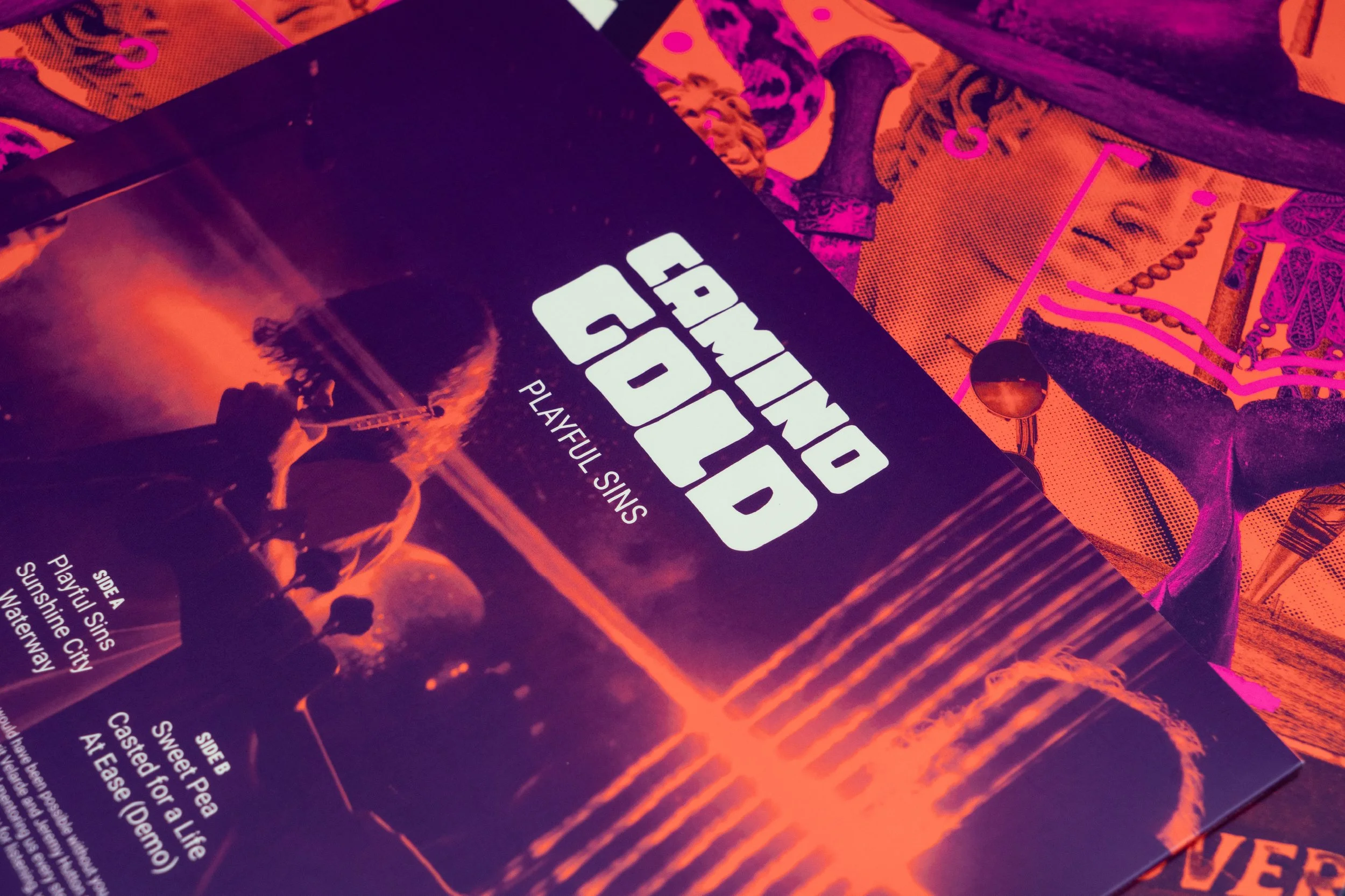
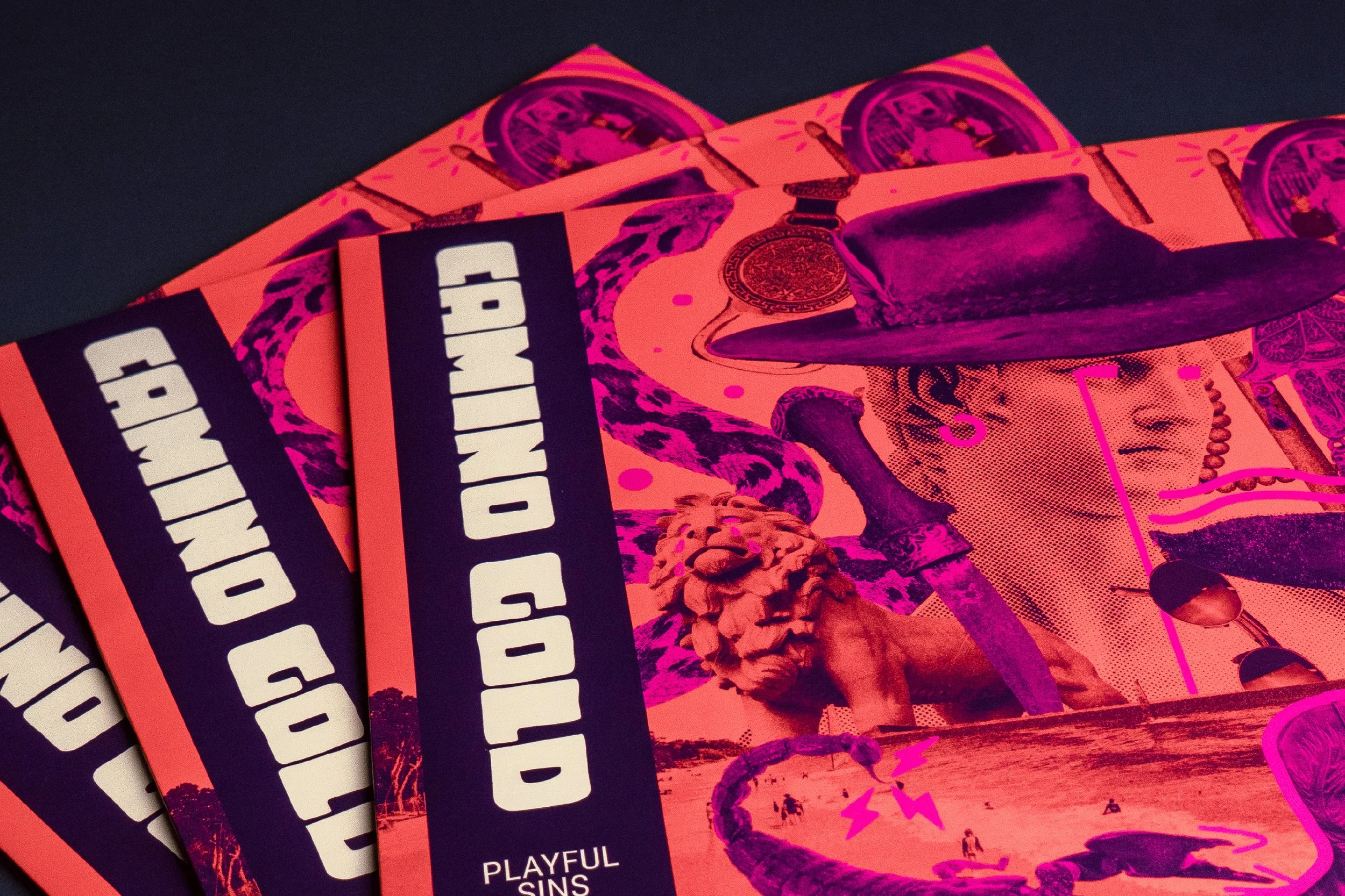
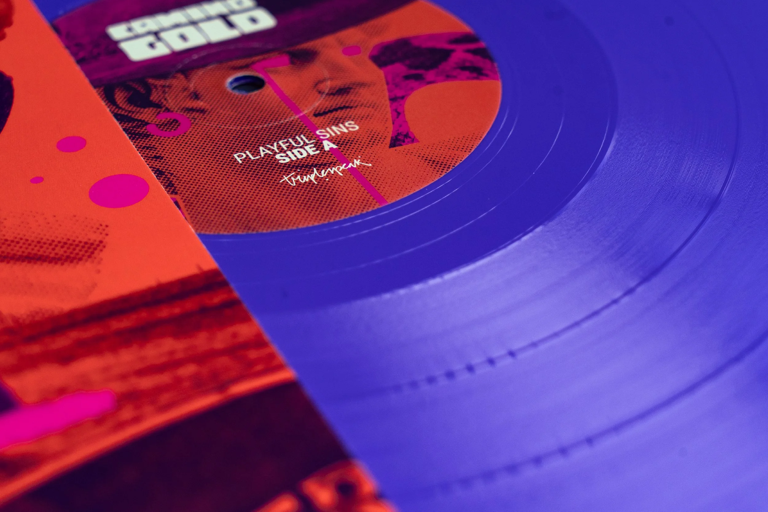
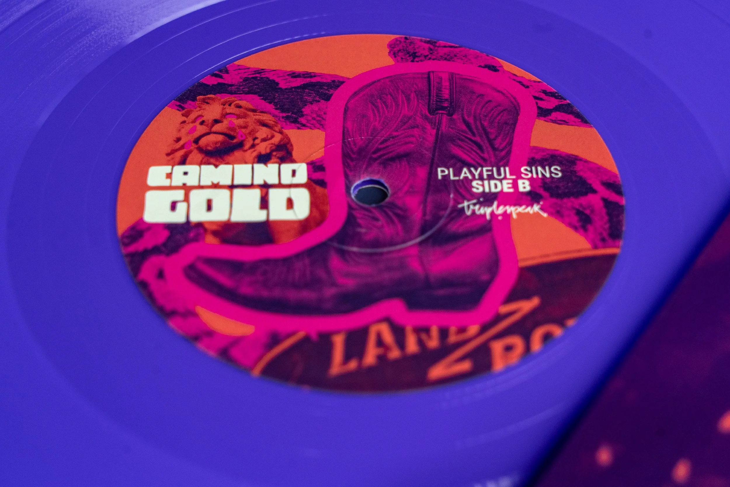
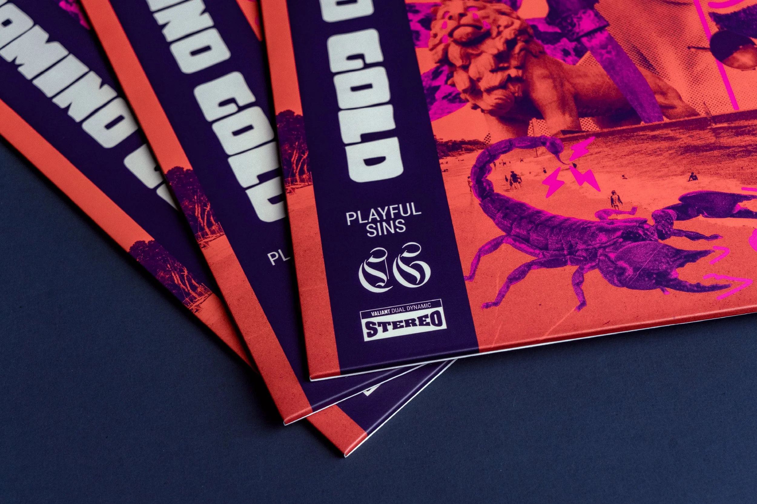
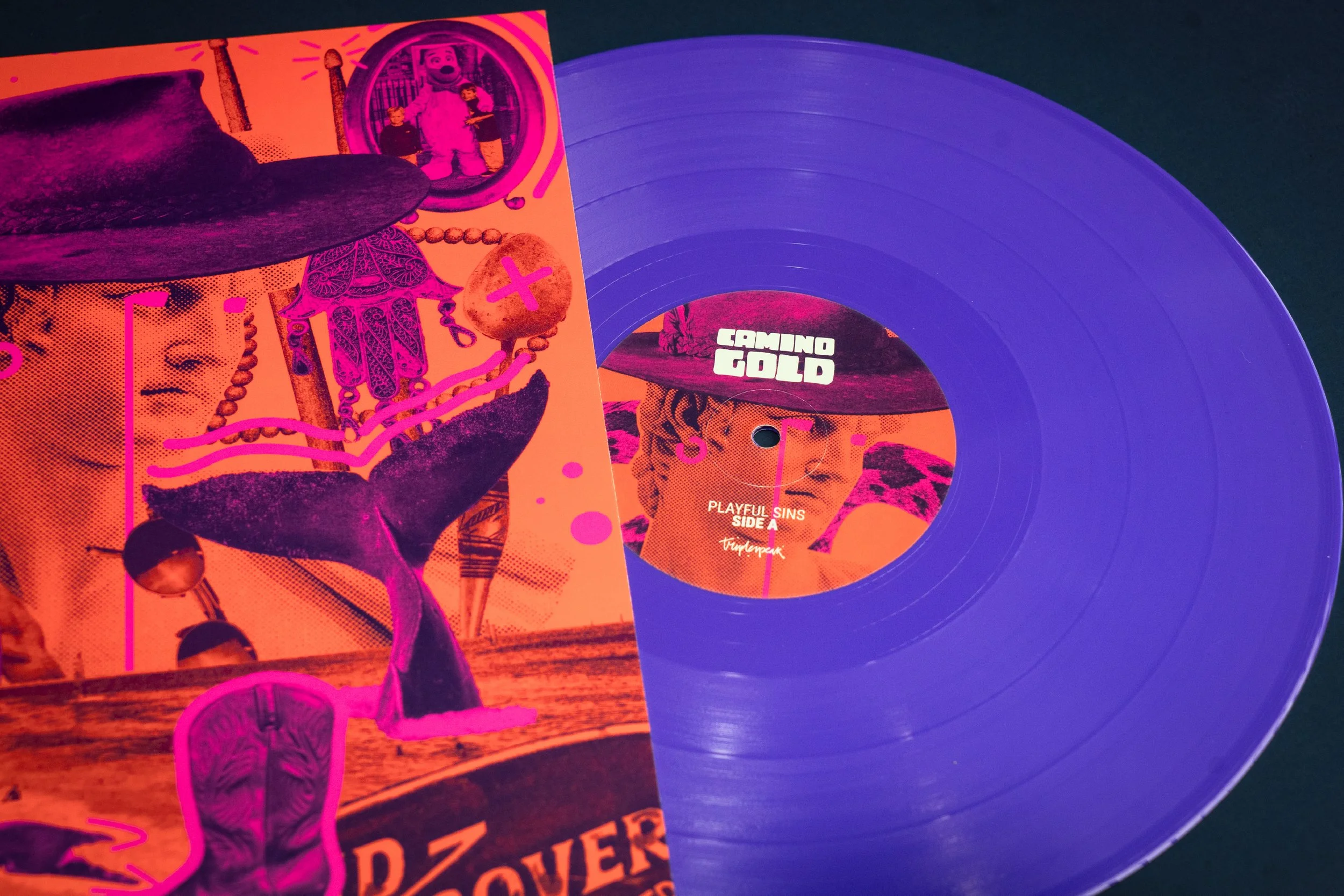
Playful SinsAs the title track and face of the 12-inch, Playful Sins needed particular cut-through. Bold colour, layered imagery and a slightly off-kilter energy gave the single its own identity, while establishing the collage, photography and illustration language that would carry across the entire EP.
WaterwayThe slower, more atmospheric sound of Waterway took the artwork somewhere deeper, with a cooler colourway and more restrained composition. The visual language stayed familiar, but shifted with the mood and pace of the track.
Sunshine CitySunshine City is a big, bright, banging tune, so the artwork followed suit. A warmer, punchier colourway gave it its own energy while keeping the photography, collage and illustration language consistent.